Content Elements
Mamo comes with 15 content elements (and more to come) that can be used in any page.
Project Summery#

Intended to be used in single project's page to show info about the project, like project description, client anme, tags or the skills used in the project and finally a link to the live project if any.
You can find a demo for this element in project-1.html (and all the single project pages) for your reference.
...
<div class="pth-project-summery">
	<!-- Project meta start -->
	<div class="pth-project-summery__meta">
		<div class="pth-project-summery__meta-item">
			<span>Client Name</span>
		</div>
		<div class="pth-project-summery__meta-item pth-project-summery__tags">
			<span>Skill 1</span>
			<span>Skill 2</span>
		</div>
	</div>
	<!-- Project meta end -->

	<!-- Project descripto start -->
	<div class="pth-project-summery__description">
		<p class="pth-has-xxl-text pth-has-light-text">Project description.</p>
	</div>
	<!-- Project descripto end -->

	<!-- Project link start -->
	<div class="pth-project-summery__link">
		<a href="#">
			Launch Website
			<span>
				<svg class="pth-outbound-link-icon" xmlns="http://www.w3.org/2000/svg" width="30px" height="30px" viewBox="0 0 30 30" stroke-width="2">
					<line x1="23" y1="23" x2="23" y2="12"/>
					<polyline points="7,7 23,7 7,23"/>
				</svg>
				<svg class="pth-outbound-link-icon" xmlns="http://www.w3.org/2000/svg" width="30px" height="30px" viewBox="0 0 30 30" stroke-width="2">
					<line x1="23" y1="23" x2="23" y2="12"/>
					<polyline points="7,7 23,7 7,23"/>
				</svg>
			</span>
		</a>
	</div>
	<!-- Project link end -->
</div>
...
Creative Image#
A cool image element with parallax effect on scroll and several layout options.
You can find a demo for this element in project-1.html (and many other pages) for your reference.
...
<div class="pth-creative-image pth-creative-image--style1">
	<div class="pth-creative-image__inner">
		<img src="assets/images/img.jpg" alt="" data-bottom-top="transform: translate3d(0,-150px,0)" data-top-bottom="transform: translate3d(0,150px,0)"/>
	</div>
</div>
...
Experement with 6 layouts by changing the modifier class .pth-creative-image--style1 to up to .pth-creative-image--style6.
You can add height classes on .pth-creative-image__inner element to define the image height relative to the viewport height.
...
<div class="pth-creative-image pth-creative-image--style6">
	<div class="pth-creative-image__inner pth-height-60vh pth-t-height-80vh pth-l-height-90vh">
		<img src="assets/images/img.jpg" alt="" data-bottom-top="transform: translate3d(0,-150px,0)" data-top-bottom="transform: translate3d(0,150px,0)"/>
	</div>
</div>
...
You also can add overlap classes, .pth-overlap-top and .pth-overlap-bottom, to the parent element to apply overlap (negative margin) from top or bottom.
...
<div class="pth-creative-image pth-creative-image--style4 pth-overlap-top">
	<div class="pth-creative-image__inner pth-height-60vh pth-t-height-80vh pth-l-height-90vh">
		<img src="assets/images/img.jpg" alt="" data-bottom-top="transform: translate3d(0,-150px,0)" data-top-bottom="transform: translate3d(0,150px,0)"/>
	</div>
</div>
...
Image & Text Combo#
An image + text combo element with parallax effect on scroll and 2 layouts, text on left and text on right.
You can find a demo for this element in project-1.html (and many other pages) for your reference.
...
<div class="pth-image-text-combo pth-image-text-combo--style1">
	<div class="pth-image-text-combo__image">
		<img src="assets/images/img.jpg" alt="" data-bottom-top="transform: translate3d(0,-150px,0)" data-top-bottom="transform: translate3d(0,150px,0)"/>
	</div>
	<div class="pth-image-text-combo__text">
		<p class="pth-has-xxl-text pth-has-light-text">Sample Text</p>
	</div>
</div>
...
You can switch the position of the image and text by changing the modifier class .pth-image-text-combo--style1 to .pth-image-text-combo--style2.
You also can add height classes on .pth-image-text-combo__image element to define the image height relative to the viewport height.
...
<div class="pth-image-text-combo pth-image-text-combo--style1">
	<div class="pth-image-text-combo__image pth-height-60vh pth-t-height-80vh pth-l-height-90vh">
		<img src="assets/images/img.jpg" alt="" data-bottom-top="transform: translate3d(0,-150px,0)" data-top-bottom="transform: translate3d(0,150px,0)"/>
	</div>
	<div class="pth-image-text-combo__text">
		<p class="pth-has-xxl-text pth-has-light-text">Sample Text</p>
	</div>
</div>
...
You also can add overlap classes, .pth-overlap-top and .pth-overlap-bottom, to the parent element to apply overlap (negative margin) from top or bottom.
...
<div class="pth-image-text-combo pth-image-text-combo--style2 pth-overlap-top">
	<div class="pth-image-text-combo__image pth-height-60vh pth-t-height-80vh pth-l-height-90vh">
		<img src="assets/images/img.jpg" alt="" data-bottom-top="transform: translate3d(0,-150px,0)" data-top-bottom="transform: translate3d(0,150px,0)"/>
	</div>
	<div class="pth-image-text-combo__text">
		<p class="pth-has-xxl-text pth-has-light-text">Sample Text</p>
	</div>
</div>
...
You also can add aligning classes, .pth-align-items-top and .pth-align-items-bottom on .pth-image-text-combo__text element to align the text to the top or bottom of the image.
...
<div class="pth-image-text-combo pth-image-text-combo--style2 pth-overlap-top">
	<div class="pth-image-text-combo__image pth-height-60vh pth-t-height-80vh pth-l-height-90vh">
		<img src="assets/images/img.jpg" alt="" data-bottom-top="transform: translate3d(0,-150px,0)" data-top-bottom="transform: translate3d(0,150px,0)"/>
	</div>
	<div class="pth-image-text-combo__text pth-align-items-bottom">
		<p class="pth-has-xxl-text pth-has-light-text">Sample Text</p>
	</div>
</div>
...
Image Gallery#
An image gallery with multiple columns layout and lightbox capability (Check GLightbox documentation for more info).
You can find a demo for this element in project-8.html for your reference.
...
<div class="pth-img-gallery">
	<div class="pth-img-gallery__list">
		<div class="pth-img-gallery__item" data-scroll>
			<a href="assets/images/image.jpg" class="glightbox" data-gallery="gallery1">
				<div class="pth-img-gallery__item-inner">
					<img src="assets/images/image.jpg" alt="">
				</div>
			</a>
		</div>

		<div class="pth-img-gallery__item" data-scroll>
			<a href="assets/images/image.jpg" class="glightbox" data-gallery="gallery1">
				<div class="pth-img-gallery__item-inner">
					<img src="assets/images/image.jpg"  alt="">
				</div>
			</a>
		</div>

		<div class="pth-img-gallery__item" data-scroll>
			<a href="assets/images/image.jpg" class="glightbox" data-gallery="gallery1">
				<div class="pth-img-gallery__item-inner">
					<img src="assets/images/image.jpg" alt="">
				</div>
			</a>
		</div>
	</div>
</div>
...
The default layout is 2 columns, you can add .pth-img-gallery--3col or .pth-img-gallery--4col to the parent element for 3 or 4 columns layout. The 2, 3 and 4 columns layout works on screens larger that mobile phones (tablets and above), and switch to 1 column layout on mobiles.
...
<div class="pth-img-gallery pth-img-gallery--3col">
	<div class="pth-img-gallery__list">
		...
	</div>
</div>
...
Image Slider#
An image slider that uses Swiper (Check Swiper documentation for more info).
You can find a demo for this element in project-7.html for your reference.
...
<div class="pth-img-slider pth-img-slider--height-70p swiper" data-scroll>
	<!-- Slides wrap start -->
	<div class="swiper-wrapper">
		<div class="pth-slide swiper-slide">
			<img src="./assets/images/img.jpg" alt="">
		</div>
		<div class="pth-slide swiper-slide">
			<img src="./assets/images/img.jpg" alt="">
		</div>
		<div class="pth-slide swiper-slide">
			<img src="./assets/images/img.jpg" alt="">
		</div>
	</div>
	<!-- Slides wrap end -->

	<!-- Slider pagination & controles start -->
	<div class="pth-img-slider__pagination"></div>
	<div class="pth-img-slider__prev">
		<span>
			<svg class="pth-left-arrow-icon" xmlns="http://www.w3.org/2000/svg" width="30px" height="30px" viewBox="0 0 30 30" stroke-width="2">
				<line x1="20.38" y1="5" x2="12.69" y2="12.69"/>
				<line x1="20.38" y1="25" x2="9.62" y2="14.23"/>
			</svg>
			<svg class="pth-left-arrow-icon" xmlns="http://www.w3.org/2000/svg" width="30px" height="30px" viewBox="0 0 30 30" stroke-width="2">
				<line x1="20.38" y1="5" x2="12.69" y2="12.69"/>
				<line x1="20.38" y1="25" x2="9.62" y2="14.23"/>
			</svg>
		</span>
	</div>
	<div class="pth-img-slider__next">
		<span>
			<svg class="pth-right-arrow-icon" xmlns="http://www.w3.org/2000/svg" width="30px" height="30px" viewBox="0 0 30 30" stroke-width="2">
				<line x1="9.62" y1="25" x2="17.31" y2="17.31"/>
				<line x1="9.62" y1="5" x2="20.38" y2="15.77"/>
			</svg>
			<svg class="pth-right-arrow-icon" xmlns="http://www.w3.org/2000/svg" width="30px" height="30px" viewBox="0 0 30 30" stroke-width="2">
				<line x1="9.62" y1="25" x2="17.31" y2="17.31"/>
				<line x1="9.62" y1="5" x2="20.38" y2="15.77"/>
			</svg>
		</span>
	</div>
	<!-- Slider pagination & controles end -->
</div>
...
You can controle the height of the slider by changing the modifier class .pth-img-slider--height-70p on the parent element. Below are the available slider height classes:
.pth-img-slider--height-40p- Apply slider height that's 40% of its width..pth-img-slider--height-50p- Apply slider height that's 50% of its width..pth-img-slider--height-60p- Apply slider height that's 60% of its width..pth-img-slider--height-70p- Apply slider height that's 70% of its width.
Text Marquee#

A cool verically scrolling text. There's no special required style or script files need to be included for this element to work.
You can find a demo for this element in project-5.html (and many other pages) for your reference.
For smooth text marquee, make sure to use even number of <span> elements (4, 6, 8 ...etc.).
...
<div class="pth-text-marquee" data-skew data-skew-horizontal data-skew-multiplier=".4">
	<div class="pth-text-marquee__outer" data-bottom-top="transform: translate3d(0vw,0,0);" data-top-bottom="transform: translate3d(-10vw,0,0);">
		<div class="pth-text-marquee__inner">
			<!-- For smooth text marquee, use even number of <span> -->
			<span>Sample Text</span>
			<span>Sample Text</span>
			<span>Sample Text</span>
			<span>Sample Text</span>
			<span>Sample Text</span>
			<span>Sample Text</span>
			<span>Sample Text</span>
			<span>Sample Text</span>
			<span>Sample Text</span>
			<span>Sample Text</span>
		</div>
	</div>
</div>
...Features#
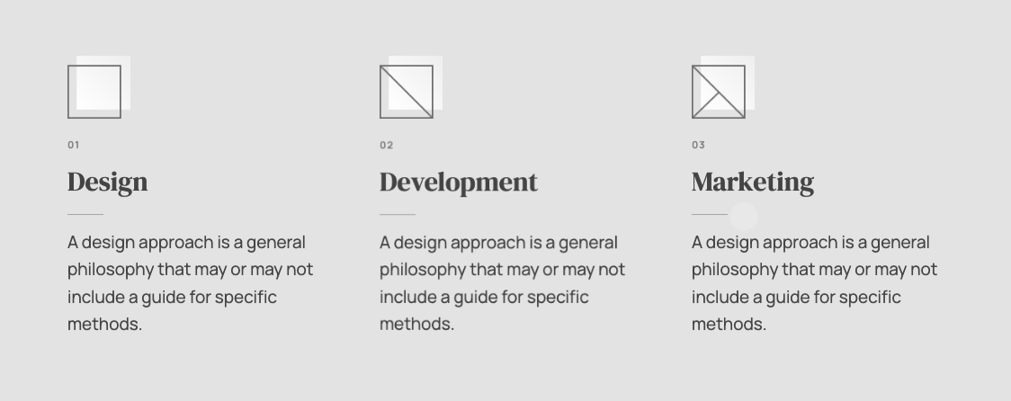
Show the features of product or service in an elegant way. Every feature has an image, small subtitle, title and description text.
You can find a demo for this element in about-1.html for your reference.
...
<div class="pth-features pth-1col pth-t-3col">
	<div class="pth-feature" data-scroll>
		<div class="pth-feature__image">
			<img width="70" height="70" src="./assets/images/feature-1.png" alt="">
		</div>
		<div class="pth-feature__text">
			<h6>01</h6>
			<h2>Title</h2>
			<p>Sample text.</p>
		</div>
	</div>

	<div class="pth-feature" data-scroll>
		<div class="pth-feature__image">
			<img width="70" height="70" src="./assets/images/feature-2.png" alt="">
		</div>
		<div class="pth-feature__text">
			<h6>02</h6>
			<h2>Title</h2>
			<p>Sample text.</p>
		</div>
	</div>

	<div class="pth-feature" data-scroll>
		<div class="pth-feature__image">
			<img width="70" height="70" src="./assets/images/feature-3.png" alt="">
		</div>
		<div class="pth-feature__text">
			<h6>03</h6>
			<h2>Title</h2>
			<p>Sample text.</p>
		</div>
	</div>
</div>
...
You can controle the number of columns on different screen sizes (mobile, tablet, laptop and desktop) by changing the helper columns classes on the parent element.
...
<div class="pth-features pth-1col pth-t-2col pth-l-4col">
	...
</div>
...Team#
Show the work team members. Every member has an image, member name, job title and social links.
You can find a demo for this element in about-2.html for your reference.
...
<div class="pth-team pth-1col pth-t-2col pth-l-3col">
	<div class="pth-team-member pth-team-member--has-social" data-scroll>
		<div class="pth-team-member__image">
			<img src="./assets/images/img.png" alt="">
		</div>
		<div class="pth-team-member__info">
			<div class="pth-team-member__name-wrap">
				<h3>Member Name</h3>
				<h6>Job Title</h6>
			</div>
			<div class="pth-team-member__social-wrap">
				<a href="#" title="Instagram">Ig</a>
				<a href="#" title="Dribbble">Dr</a>
				<a href="#" title="Behance">Be</a>
			</div>
		</div>
	</div>

	<div class="pth-team-member" data-scroll>
		<div class="pth-team-member__image">
			<img src="./assets/images/img.png" alt="">
		</div>
		<div class="pth-team-member__info">
			<div class="pth-team-member__name-wrap">
				<h3>Member Name</h3>
				<h6>Job Title</h6>
			</div>
		</div>
	</div>

	<div class="pth-team-member" data-scroll>
		<div class="pth-team-member__image">
			<img src="./assets/images/img.png" alt="">
		</div>
		<div class="pth-team-member__info">
			<div class="pth-team-member__name-wrap">
				<h3>Member Name</h3>
				<h6>Job Title</h6>
			</div>
		</div>
	</div>
</div>
...
Notice the difference between a member code with and without social links. The member with social links has the pth-team-member__social-wrap block in addition to .pth-team-member--has-social class on the member wrap element.
...
<!-- With social links -->
<div class="pth-team-member pth-team-member--has-social" data-scroll>
	<div class="pth-team-member__image">
		<img src="./assets/images/img.png" alt="">
	</div>
	<div class="pth-team-member__info">
		<div class="pth-team-member__name-wrap">
			<h3>Member Name</h3>
			<h6>Job Title</h6>
		</div>
		<div class="pth-team-member__social-wrap">
			<a href="#" title="Instagram">Ig</a>
			<a href="#" title="Dribbble">Dr</a>
			<a href="#" title="Behance">Be</a>
		</div>
	</div>
</div>

<!-- Without social links -->
<div class="pth-team-member" data-scroll>
	<div class="pth-team-member__image">
		<img src="./assets/images/img.png" alt="">
	</div>
	<div class="pth-team-member__info">
		<div class="pth-team-member__name-wrap">
			<h3>Member Name</h3>
			<h6>Job Title</h6>
		</div>
	</div>
</div>
...
You can controle the number of columns on different screen sizes (mobile, tablet, laptop and desktop) by changing the helper columns classes on the parent element.
...
<div class="pth-team pth-1col pth-t-2col pth-l-3col">
	...
</div>
...Clients#
A simple element to show the clients of the product or service.
You can find a demo for this element in about-1.html for your reference.
...
<div class="pth-clients" data-scroll>
	<div class="pth-clients__inner pth-2col pth-t-3col pth-col-nogap">
		<div class="pth-client">
			<span class="pth-client__corner-tl"></span>
			<span class="pth-client__corner-tr"></span>
			<span class="pth-client__corner-bl"></span>
			<span class="pth-client__corner-br"></span>
			<div class="pth-client__image">
				<img src="./assets/images/image.png" width="53" height="89" alt="">
			</div>
		</div>

		<div class="pth-client">
			<span class="pth-client__corner-tl"></span>
			<span class="pth-client__corner-tr"></span>
			<span class="pth-client__corner-bl"></span>
			<span class="pth-client__corner-br"></span>
			<div class="pth-client__image">
				<img src="./assets/images/image.png" width="84" height="60" alt="">
			</div>
		</div>

		<div class="pth-client">
			<span class="pth-client__corner-tl"></span>
			<span class="pth-client__corner-tr"></span>
			<span class="pth-client__corner-bl"></span>
			<span class="pth-client__corner-br"></span>
			<div class="pth-client__image">
				<img src="./assets/images/image.png" width="62" height="70" alt="">
			</div>
		</div>
	</div>
</div>
...
You can controle the number of columns on different screen sizes (mobile, tablet, laptop and desktop) by changing the helper columns classes on .pth-clients__inner element. Also the helper class .pth-col-nogap is applied to remove any gaps between columns.
...
<div class="pth-clients" data-scroll>
	<div class="pth-clients__inner pth-2col pth-t-3col pth-col-nogap">
		...
	</div>
</div>
...Accordions#

Accordion toggles that use Accordion (Check Accordion documentation for more info).
You can find a demo for this element in about-2.html for your reference.
...
<div class="pth-accordion" data-scroll>
	<!-- Panel start -->
	<div class="pth-accordion__item">
		<div class="pth-accordion__trigger">
			<h3>Panel Trigger</h3>
		</div>
		<div class="pth-accordion__panel">
			<div class="pth-accordion__panel-inner">
				<p>Sample text.</p>
			</div>
		</div>
	</div>
	<!-- Panel end -->

	<!-- Panel start -->
	<div class="pth-accordion__item">
		<div class="pth-accordion__trigger">
			<h3>Panel Trigger</h3>
		</div>
		<div class="pth-accordion__panel">
			<div class="pth-accordion__panel-inner">
				<p>Sample text.</p>
			</div>
		</div>
	</div>
	<!-- Panel end -->
</div>
...Counters#

Cool counters with animation on reveal.
You can find a demo for this element in about-1.html for your reference.
...
<div class="pth-counters pth-1col pth-t-2col">
	<!-- Counter start -->
	<div class="pth-counter" data-scroll>
		<div class="pth-counter__number-wrap">
			<div class="pth-counter__number">
				<div class="pth-counter__random-number">
					<!-- Random number before reveal, put each digit in a <span>, use the same number of digits as the final number -->
					<span>3</span><span>4</span><span>1</span>
				</div>
				<div class="pth-counter__final-number">
					<!-- Final number after reveal, put each digit in a <span>, use the same number of digits as the random number -->
					<span>4</span><span>5</span><span>2</span>
				</div>
			</div>
		</div>
		<div class="pth-counter__label">Title</div>
	</div>
	<!-- Counter end -->

	<!-- Counter start -->
	<div class="pth-counter" data-scroll>
		<div class="pth-counter__number-wrap">
			<div class="pth-counter__number">
				<div class="pth-counter__random-number">
					<!-- Random number before reveal, put each digit in a <span>, use the same number of digits as the final number -->
					<span>7</span><span>3</span>
				</div>
				<div class="pth-counter__final-number">
					<!-- Final number after reveal, put each digit in a <span>, use the same number of digits as the random number -->
					<span>8</span><span>4</span>
				</div>
			</div>
		</div>
		<div class="pth-counter__label">Title</div>
	</div>
	<!-- Counter end -->
</div>
...
The "random" number is the initial number before the reveal animation, the "final" number is the actual final number after animation. Pay attention to the comments n the code above.
You can controle the number of columns on different screen sizes (mobile, tablet, laptop and desktop) by changing the helper columns classes on the parent element.
...
<div class="pth-counters pth-1col pth-t-2col pth-l-4col">
	...
</div>
...
You also can add a prefix or suffix (or both) to the number.
Prefix example:
...
<div class="pth-counter" data-scroll>
	<div class="pth-counter__number-wrap">
	<div class="pth-counter__prefix">$</div> <!-- <<< this -->
		<div class="pth-counter__number">
			<div class="pth-counter__random-number">
				<span>7</span><span>3</span>
			</div>
			<div class="pth-counter__final-number">
				<span>8</span><span>4</span>
			</div>
		</div>
	</div>
	<div class="pth-counter__label">Title</div>
</div>
...
Suffix example:
...
<div class="pth-counter" data-scroll>
	<div class="pth-counter__number-wrap">
		<div class="pth-counter__number">
			<div class="pth-counter__random-number">
				<span>7</span><span>3</span>
			</div>
			<div class="pth-counter__final-number">
				<span>8</span><span>4</span>
			</div>
		</div>
		<div class="pth-counter__suffix">%</div> <!-- <<< this -->
	</div>
	<div class="pth-counter__label">Title</div>
</div>
...Testimonials#

A testimonials slider that uses Swiper (Check Swiper documentation for more info).
You can find a demo for this element in about-1.html for your reference.
...
<div class="pth-testimonials swiper" data-scroll>
	<div class="swiper-wrapper">
		<!-- Testimonial start -->
		<div class="pth-testimonial swiper-slide">
			<div class="pth-testimonial__comment">Testimonial text</div>
			<footer class="pth-testimonial__author">
				<img src="./assets/images/avatart.png" alt="">
				<div class="pth-testimonial__author-name">Author Name</div>
				<div class="pth-testimonial__author-title">Author Job Title</div>
			</footer>
		</div>
		<!-- Testimonial end -->
	</div>
</div>
...
Creative Map#
An elegant map powered by Google Maps and has custom colors. It's too similar to the creative image element and has the same layout options that can be applied using the modifier class from pth-creative-map--style1 to pth-creative-map--style6.
You can find a demo for this element in contact-1.html for your reference.
Google Maps API script is required for the map to work (link tag below). Include it before "lib.js" & "scripts.js" at the bottom of the page body.
Here is the link tag for the Google Maps API script. You will need to replace <API_KEY> with an actual Google Maps API key. Get your Google Maps API key from here.
<script src="https://maps.googleapis.com/maps/api/js?v=3&key=<API_KEY>"></script>Below the actual element code.
...
<div class="pth-creative-map pth-creative-map--style2">
	<div class="pth-creative-map__inner pth-map pth-height-60vh pth-t-height-80vh pth-l-height-90vh"
		data-lat="43.1122004"
		data-lng="12.4505106"
		data-info="Hello World!"
		data-zoom="14"
		data-zoom-control="off"
		data-labels="on"
		data-icons="off"
		data-land-color="#eeeeee"
		data-transit-color="#bbbbbb"
		data-road-color="#d7d7d7"
		data-highway-color="#cccccc"
		data-highway-stroke-color="#bbbbbb"
		data-water-color="#bbbbbb"
		data-text-color="#666666"
		data-text-stroke-color="#f3f3f3"
		data-marker-color="#444444"></div>
</div>
...
You can add height classes on .pth-creative-map__inner element to define the image height relative to the viewport height.
There are a bunch of "data" attributes that define the settings of the map, let's break them down:
data-lat- Defines the latitude of the map location.data-lng- Defines the longitude of the map location.data-info- Defines the text info of the location bubble.data-zoom- Defines the zoom of the map.data-zoom-control- Turn map zoom controles "on" or "off".data-labels- Turn map labels "on" or "off".data-icons- Turn map icons "on" or "off".data-land-color- Defines the land color.data-transit-color- Defines the transit color.data-road-color- Defines the road color.data-highway-color- Defines the highway color.data-highway-stroke-color- Defines the highway stroke color.data-water-color- Defines the water color.data-text-color- Defines the text color.data-text-stroke-color- Defines the text stroke color.data-marker-color- Defines the lang color.
Contact Info#
A simple element to show contact info. There's no special required style or script files need to be included for this element to work.
You can find a demo for this element in contact-1.html for your reference.
...
<div class="pth-contact-info pth-1col pth-t-2col">
	<div class="pth-align-text-left">
		<h6>Visit Us</h6>
		<p class="pth-has-light-text">873 Whiteman Street</p>
		<p class="pth-has-light-text">Pleasantville</p>
		<p class="pth-has-light-text">NewJersey</p>
	</div>
	<div class="pth-align-text-right">
		<h6>Say Hello</h6>
		<p class="pth-has-light-text"><a href="mailto:contact@myagency.com">contact@myagency.com</a></p>
		<p class="pth-has-light-text"><a href="tel:609-887-6135">6098876135</a></p>
	</div>
</div>
...
You can controle the number of columns on different screen sizes (mobile, tablet, laptop and desktop) by changing the helper columns classes on the parent element. You also can use the helper typography classes .pth-align-text-left or .pth-align-text-right on the each information wrapper to controle the text alignment.
Map & Text#
This element shows both a map and contact info in one block, it's a mix of contact info element and creative map element, and has the same layout options of the image & text combo element. Please refere to them for any available settings & options.
You can find a demo for this element in contact-2.html for your reference.
...
<div class="pth-map-text-combo pth-map-text-combo--style1 pth-overlap-bottom">
	<!-- Map start -->
	<div class="pth-map-text-combo__map pth-map pth-height-60vh pth-t-height-80vh pth-l-height-90vh"
		data-lat="43.1122004"
		data-lng="12.4505106"
		data-info="Hello World!"
		data-zoom="14"
		data-zoom-control="off"
		data-labels="on"
		data-icons="off"
		data-land-color="#343434"
		data-transit-color="#666666"
		data-road-color="#444444"
		data-highway-color="#555555"
		data-highway-stroke-color="#333333"
		data-water-color="#222222"
		data-text-color="#aaaaaa"
		data-text-stroke-color="#333333"
		data-marker-color="#dddddd"></div>
	<!-- Map end -->

	<!-- Contact info start -->
	<div class="pth-map-text-combo__text pth-align-items-top">
		<div class="pth-contact-info pth-1col">
			<div>
				<h6>Visit Us</h6>
				<p class="pth-has-light-text">873 Whiteman Street</p>
				<p class="pth-has-light-text">Pleasantville</p>
				<p class="pth-has-light-text">NewJersey</p>
			</div>
			<div>
				<h6>Say Hello</h6>
				<p class="pth-has-light-text"><a href="mailto:contact@myagency.com">contact@myagency.com</a></p>
				<p class="pth-has-light-text"><a href="tel:6098876135">609-887-6135</a></p>
			</div>
		</div>
	</div>
	<!-- Contact info end -->
</div>
...