General
Main HTML Structure#
Every page in Mamo follows a simple main HTML structure. Here is the simplified structure for your reference:
<!DOCTYPE html>
<html lang="en">
	<head>

		<meta charset="UTF-8">
		<meta name="description" content="A modern HTML site template for creatives.">
		<meta name="keywords" content="Creative, Portfolio, Template, HTML, CSS, JavaScript">
		<meta name="viewport" content="width=device-width, initial-scale=1.0">
		<meta name="theme-color" content="#D8315B">

		<!-- Favicons -->
		<link rel="icon" href="./assets/images/favicon-32.png" sizes="32x32" />
		<link rel="icon" href="./assets/images/favicon-192.png" sizes="192x192" />
		<link rel="apple-touch-icon" href="./assets/images/favicon-480.png" />

		<!-- Fonts -->
		<link href="https://fonts.googleapis.com/css2?family=DM+Serif+Display:ital@0;1&family=Manrope:wght@300;400;700&display=swap" rel="stylesheet">

		<!-- Template styles -->
		<link rel="stylesheet" href="./assets/css/style.css">
		<style media="screen">
			:root {
				--bg-color: #E3E3E3;
				--bg-color-rgb: 227,227,227;
				--secondary-color: #FFFFFF;
				--secondary-color-rgb: 255,255,255;
				--content-color: #444444;
				--content-color-rgb: 68,68,68;
			}
		</style>

		<title>Mamo</title>

	</head>
	<body>

		<!-- Preloader start -->
		<div class="pth-preloader">
			...
		</div>
		<!-- Preloader end -->

		<!-- Wrapper start -->
		<div class="pth-wrapper">

			<!-- Header start -->
			<header class="pth-header">
				...
			</header>
			<!-- Header end -->

			<!-- Scroll wrap start -->
			<div class="pth-scroll-wrap" data-scroll-container>

				<!-- Content wrap start -->
				<div class="pth-content-wrap">

					<!-- Intro start -->
					<div class="pth-intro">
						...
					</div>
					<!-- Intro end -->

					<!-- Content start -->
					<main class="pth-content">
						<div class="pth-content__main">
							...
						</div>
					</main>
					<!-- Content end -->

					<!-- Footer start -->
					<div class="pth-footer-actions">
						...

						<footer class="pth-footer">
							...
						</footer>
					</div>
					<!-- Footer end -->

				</div>
				<!-- Content wrap end -->

			</div>
			<!-- Scroll wrap end -->

			<!-- Side panels start -->
			<div class="pth-side-panel">
				...
			</div>
			<!-- Side panels end -->

		</div>
		<!-- Wrapper end -->

		<!-- Custom cursor start -->
		<div class="pth-cursor pth-cursor--leave">
			<div class="pth-cursor__thumb"><img src="#" alt=""/></div>
		</div>
		<!-- Custom cursor end -->

		<!-- Template scripts -->
		<script src="./assets/js/lib.js"></script>
		<script src="./assets/js/scripts.js"></script>

	</body>
</html>
Default Style & Scripts#
Below are the default style that must be included in the page's <head> in order for the template to work properly:
<html>
	<head>
		...
		<!-- Template styles -->
		<link rel="stylesheet" href="./assets/css/style.css">
		...
	</head>

	<body>
		...
	</body>
</html>
The "style.css" contains all the styles of the template.
Below are the default scripts that must be included at the end of the page's <body> in order for the template to work properly:
<html>
	<head>
		...
	</head>

	<body>
		...
		<!-- Template scripts -->
		<script src="./assets/js/lib.js"></script>
		<script src="./assets/js/scripts.js"></script>
	</body>
</html>
"lib.js" is required libraries which are Accordion, Anime JS, GLightbox, imagesLoaded, Isotope, ScrollOut, Skrollr, Swiper, and "scripts.js" is all the scripts of the template.
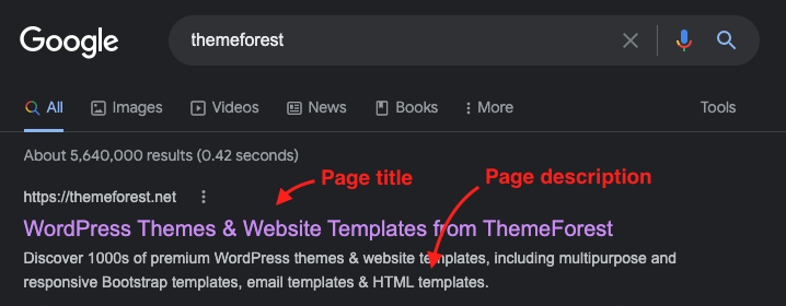
Page Title, Description & Keywords#
In the <head> section of every page, you need to customize the page title to reflect your site or brand name, this is the title that shows up in the browser's tab or search results for example, and is very important for SEO.
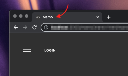
Just customize the text between <title> and </title> tags.
<head>
	...
	<title>Mamo</title>
	...
</head>
Also, you need to customize the description and keywords meta tags on every page. These should have some descriping text and keywords that relate to the service/product that the website's owner offer. Just edit the content inside the double quotes of each tag.
<head>
	...
	<meta name="description" content="A modern HTML site template for creatives.">
	<meta name="keywords" content="Creative, Portfolio, Template, HTML, CSS, JavaScript">
	...
</head>
These tag used for SEO and the page description shows up in the search results undeneath the page title.
Favicon#
<head>
	...
	<link rel="icon" href="./assets/images/favicon-32.png" sizes="32x32" />
	<link rel="icon" href="./assets/images/favicon-192.png" sizes="192x192" />
	<link rel="apple-touch-icon" href="./assets/images/favicon-480.png" />
	...
</head>
You need to customize the favicon to reflect your site or brand logo, this is the tiny image that shows up in the browser's tab beside the page title for example.
Create square image of your logo (or whatever you want) and export it in PNG format with 3 different sizes, 32x32 pixel, 192x192 pixel and 480x480 pixel. And name them like that "favicon-32.png", "favicon-192.png" and "favicon-480.png", then replace the default favicon files in ./assets/images/ with yours, and the favicon will update automatically.
Fonts#
Mamo HTML template uses Google Fonts by default, you can change the fonts with other Google fonts or other web fonts from any provider (Adobe Fonts ...etc).
The template supports 2 different font families, one is the normal font, it's used as the main font of the template and has 3 different weights, and the other one is the display font, it's used as the accent font for headings and many other elements and has 2 different weights.
<head>
...
<link href="https://fonts.googleapis.com/css2?family=DM+Serif+Display:ital@0;1&family=Manrope:wght@300;400;700&display=swap" rel="stylesheet">
...
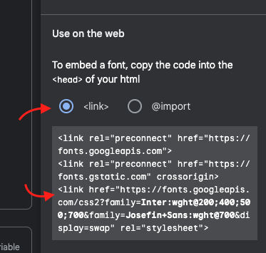
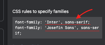
</head>In order to replace the default fonts with yours, you need to replace the font <link> with the one that you got from your webfont provider, it links to the fonts files. Here's an example from Google Fonts (Google Fonts provides 3 links, only the last one is required).
Then open "style.css" (and "style-rtl.css" if needed), then uder "Variables" section replace font family name and weights (for both, normal & display fonts) with the ones that you got from your webfont provider. You even can adjust line height, font sizes ...etc. if needed. Notice that any change in font weight or sizes ...etc. will affect the entire website.
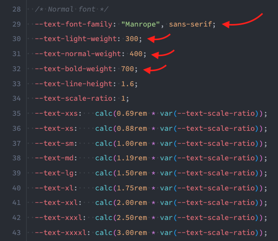
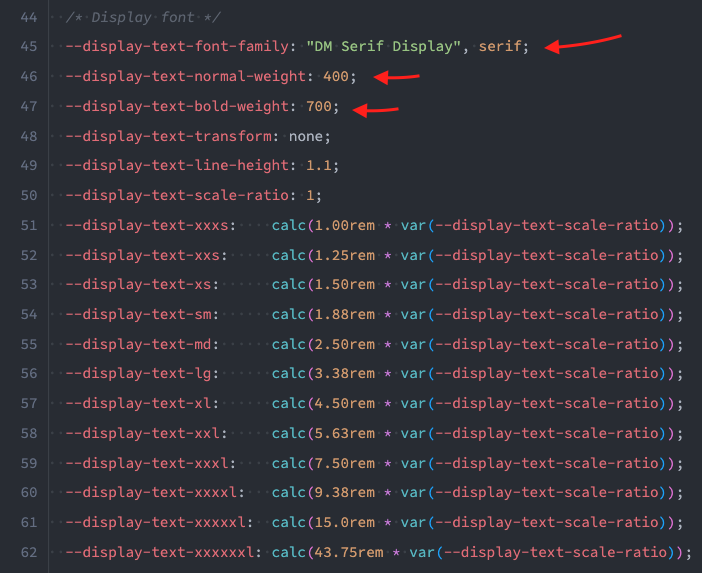
Here's an example from Google Fonts.
Colors#
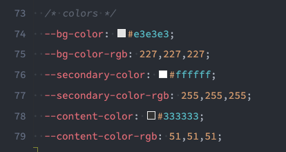
The template has 3 colors that you can customize, background color which is the main color of the page's background, secondary color which is used in some elements (recommended to be slightly lighter or darker than the background color), and content color which is the color of text, icons and anything that's considered as foreground element.
Open "style.css" (and "style-rtl.css" if needed), then uder "Variables" section find the colors variables and change them to your needs. Notice that every color has HEX version and RGB version (the RGB version has only the 3 numeric values seperated with commas as shown below)
With Mamo HTML template you can have every single page with its own diferent colors. So you can make your projects stand out with custom color for every page. To do so, you need to add/edit the inline <style> block inside the <head> section (as below) on every page that you want to diffrentiate its colors and customize the colors to your needs (or remove it from all the pages if you want the default colors in "style.css" to be applied to all the pages).
Notice that the inline <style> block must follow the main template stylesheet link.
<head>
	...
	<link rel="stylesheet" href="./assets/css/style.css">
	<style media="screen">
		:root {
			--bg-color: #E3E3E3;
			--bg-color-rgb: 227,227,227;
			--secondary-color: #FFFFFF;
			--secondary-color-rgb: 255,255,255;
			--content-color: #444444;
			--content-color-rgb: 68,68,68;
		}
	</style>
	...
</head>
Also, you can use the theme-color meta tag with the background color in the <head> of every page to customize the tool bar color on supported mobile browsers.
<head>
	...
	<meta name="theme-color" content="#FFE869"><!-- Must match bg-color value for this page -->
	...
</head>Preloader#
Mamo HTML template comes with 3 options for the page preloading animation. The first and second options are too similar and share the same structure below.
...
<div class="pth-preloader">
	<div class="pth-preloader__inner">
		<div class="pth-preloader__el-one"></div>
		<div class="pth-preloader__el-two"></div>
	</div>

	<svg class="pth-preloader-overlay pth-overlay" width="100%" height="100%" viewBox="0 0 100 100" preserveAspectRatio="none">
		<path vector-effect="non-scaling-stroke" d="M 0 100 V 100 Q 50 100 100 100 V 100 z" />
	</svg>
</div>
...
Just the modifier class of theparent is different, check the details below.
-
The pulsing animation. You can get this animation by adding
pth-preloader--style-1modifier class to the preloader parent element.
... <div class="pth-preloader pth-preloader--style-1"> ... </div> ... -
The loading bar animation. You can get this animation by adding
pth-preloader--style-2modifier class to the preloader parent element.
... <div class="pth-preloader pth-preloader--style-2"> ... </div> ... -
Finally you can use a custom image, this option has a slightly different code, so replace the code above with the code below after adding the path to your custom image. You can use any image type JPG, PNG or animated GIF.
...
<div class="pth-preloader pth-preloader--custom">
	<div class="pth-preloader__image">
		<img src="./assets/images/your-image.gif" alt="">
	</div>

	<svg class="pth-preloader-overlay pth-overlay" width="100%" height="100%" viewBox="0 0 100 100" preserveAspectRatio="none">
		<path vector-effect="non-scaling-stroke" d="M 0 100 V 100 Q 50 100 100 100 V 100 z" />
	</svg>
</div>
...
Helper Classes#
The template come with some handy helper classes for several purposes, check the details below.
Typography#
Display font classes:
.pth-has-display-font- Apply the display font family styles (font family, weight, line height and transform)..pth-has-bold-display-text- Apply the bold display font weight..pth-has-xxxs-display-text- Apply the xxxs display font size..pth-has-xxs-display-text- Apply the xxs display font size..pth-has-xs-display-text- Apply the xs display font size..pth-has-sm-display-text- Apply the sm display font size..pth-has-md-display-text- Apply the md display font size..pth-has-lg-display-text- Apply the lg display font size..pth-has-xl-display-text- Apply the xl display font size..pth-has-xxl-display-text- Apply the xxl display font size..pth-has-xxxl-display-text- Apply the xxxl display font size..pth-has-xxxxl-display-text- Apply the xxxxl display font size..pth-has-xxxxxl-display-text- Apply the xxxxxl display font size..pth-has-xxxxxxl-display-text- Apply the xxxxxxl display font size.
Normal font classes:
.pth-has-light-text- Apply the light font weight..pth-has-bold-text- Apply the bold font weight..pth-has-xxs-text- Apply the xxs font size..pth-has-xs-text- Apply the xs font size..pth-has-sm-text- Apply the sm font size..pth-has-md-text- Apply the md font size..pth-has-lg-text- Apply the lg font size..pth-has-xl-text- Apply the xl font size..pth-has-xxl-text- Apply the xxl font size..pth-has-xxxl-text- Apply the xxxl font size..pth-has-xxxxl-text- Apply the xxxxl font size.
General typography classes:
.pth-align-text-left- Align text to left..pth-align-text-right- Align text to right.
Example:
...
<div class="pth-has-xl-text pth-has-bold-text">
	Now this element has XL bold text.
</div>
...
<div class="pth-has-display-font pth-has-sm-display-text">
	Now this element has small display text.
</div>
...Layout#
Responsive columns classes:
.pth-1col- Apply 1 column layout..pth-2col- Apply 2 columns layout..pth-3col- Apply 3 columns layout..pth-4col- Apply 4 columns layout..pth-5col- Apply 5 columns layout..pth-6col- Apply 6 columns layout..pth-t-1col- Apply 1 column layout on tablet screen size and above. "t" stands for tablet..pth-t-2col- Apply 2 columns layout on tablet screen size and above. "t" stands for tablet..pth-t-3col- Apply 3 columns layout on tablet screen size and above. "t" stands for tablet..pth-t-4col- Apply 4 columns layout on tablet screen size and above. "t" stands for tablet..pth-t-5col- Apply 5 columns layout on tablet screen size and above. "t" stands for tablet..pth-t-6col- Apply 6 columns layout on tablet screen size and above. "t" stands for tablet..pth-l-1col- Apply 1 column layout on laptop screen size and above. "l" stands for laptop..pth-l-2col- Apply 2 columns layout on laptop screen size and above. "l" stands for laptop..pth-l-3col- Apply 3 columns layout on laptop screen size and above. "l" stands for laptop..pth-l-4col- Apply 4 columns layout on laptop screen size and above. "l" stands for laptop..pth-l-5col- Apply 5 columns layout on laptop screen size and above. "l" stands for laptop..pth-l-6col- Apply 6 columns layout on laptop screen size and above. "l" stands for laptop..pth-d-1col- Apply 1 column layout on desktop screen size and above. "d" stands for desktop..pth-d-2col- Apply 2 columns layout on desktop screen size and above. "d" stands for desktop..pth-d-3col- Apply 3 columns layout on desktop screen size and above. "d" stands for desktop..pth-d-4col- Apply 4 columns layout on desktop screen size and above. "d" stands for desktop..pth-d-5col- Apply 5 columns layout on desktop screen size and above. "d" stands for desktop..pth-d-6col- Apply 6 columns layout on desktop screen size and above. "d" stands for desktop.
Example:
The "child" elements inside the "parent" elements will be arranged in 1 column on small screens (smaller than tablets), then in 2 column on tablet screen size (smaller than laptops), then in 3 columns on laptop screen size and above.
...
<div class="pth-1col pth-t-2col pth-l-3col">
	<div> ... </div>
	<div> ... </div>
	<div> ... </div>
</div>
...
Viewport-relative height classes:
.pth-height-100vh- Apply 100vh height..pth-height-90vh- Apply 90vh height..pth-height-80vh- Apply 80vh height..pth-height-70vh- Apply 70vh height..pth-height-60vh- Apply 60vh height..pth-height-50vh- Apply 50vh height..pth-height-40vh- Apply 40vh height..pth-height-30vh- Apply 30vh height..pth-height-20vh- Apply 20vh height..pth-height-10vh- Apply 10vh height..pth-t-height-100vh- Apply 100vh height on tablet screen size and above. "t" stands for tablet..pth-t-height-90vh- Apply 90vh height on tablet screen size and above. "t" stands for tablet..pth-t-height-80vh- Apply 80vh height on tablet screen size and above. "t" stands for tablet..pth-t-height-70vh- Apply 70vh height on tablet screen size and above. "t" stands for tablet..pth-t-height-60vh- Apply 60vh height on tablet screen size and above. "t" stands for tablet..pth-t-height-50vh- Apply 50vh height on tablet screen size and above. "t" stands for tablet..pth-t-height-40vh- Apply 40vh height on tablet screen size and above. "t" stands for tablet..pth-t-height-30vh- Apply 30vh height on tablet screen size and above. "t" stands for tablet..pth-t-height-20vh- Apply 20vh height on tablet screen size and above. "t" stands for tablet..pth-t-height-10vh- Apply 10vh height on tablet screen size and above. "t" stands for tablet..pth-l-height-100vh- Apply 100vh height on laptop screen size and above. "l" stands for laptop..pth-l-height-90vh- Apply 90vh height on laptop screen size and above. "l" stands for laptop..pth-l-height-80vh- Apply 80vh height on laptop screen size and above. "l" stands for laptop..pth-l-height-70vh- Apply 70vh height on laptop screen size and above. "l" stands for laptop..pth-l-height-60vh- Apply 60vh height on laptop screen size and above. "l" stands for laptop..pth-l-height-50vh- Apply 50vh height on laptop screen size and above. "l" stands for laptop..pth-l-height-40vh- Apply 40vh height on laptop screen size and above. "l" stands for laptop..pth-l-height-30vh- Apply 30vh height on laptop screen size and above. "l" stands for laptop..pth-l-height-20vh- Apply 20vh height on laptop screen size and above. "l" stands for laptop..pth-l-height-10vh- Apply 10vh height on laptop screen size and above. "l" stands for laptop..pth-d-height-100vh- Apply 100vh height on desktop screen size and above. "d" stands for desktop..pth-d-height-90vh- Apply 90vh height on desktop screen size and above. "d" stands for desktop..pth-d-height-80vh- Apply 80vh height on desktop screen size and above. "d" stands for desktop..pth-d-height-70vh- Apply 70vh height on desktop screen size and above. "d" stands for desktop..pth-d-height-60vh- Apply 60vh height on desktop screen size and above. "d" stands for desktop..pth-d-height-50vh- Apply 50vh height on desktop screen size and above. "d" stands for desktop..pth-d-height-40vh- Apply 40vh height on desktop screen size and above. "d" stands for desktop..pth-d-height-30vh- Apply 30vh height on desktop screen size and above. "d" stands for desktop..pth-d-height-20vh- Apply 20vh height on desktop screen size and above. "d" stands for desktop..pth-d-height-10vh- Apply 10vh height on desktop screen size and above. "d" stands for desktop.
Example:
The element will have 80vh height on small screens (smaller than laptops), then 60vh height on laptop screen size and above.
...
<div class="pth-height-80vh pth-l-height-60vh">
	...
</div>
...
Miscellaneous layout classes:
.pth-half-width- Apply 50% width on tablet screesn and above..pth-half-width-shifted- Apply 50% width on tablet screesn and above and shilf the element to the other side..pth-full-width- Apply 100vw width..pth-wide-width- Apply wide width (100vw - 240px)..pth-overlap-top- Apply negative top margin..pth-overlap-bottom- Apply negative bottom margin..pth-align-items-top- Applyalign-items: flex-start;to an element with flex layout..pth-align-items-bottom- Applyalign-items: flex-end;to an element with flex layout.